eCommerce Product Photography That Sells
A product photograph has a job, and it is not to look nice. Each shot in a set answers one question that would otherwise stop the purchase.


Loading Article banner

On a marketplace, images do more work than any sentence on the page. They are what a shopper processes first, they carry the objections in less space than words, and they are the least maintained part of most catalogues.
Good product photography is not a matter of taste. Each shot in a set has a job, and a set that misses one leaves a question the copy has to answer instead, which it will do less well.
The main image sells the click
It appears in search results at thumbnail size against a row of competitors, so it competes on legibility rather than beauty. The product large in frame, on the background the marketplace requires, cropped so the shape reads at a glance.
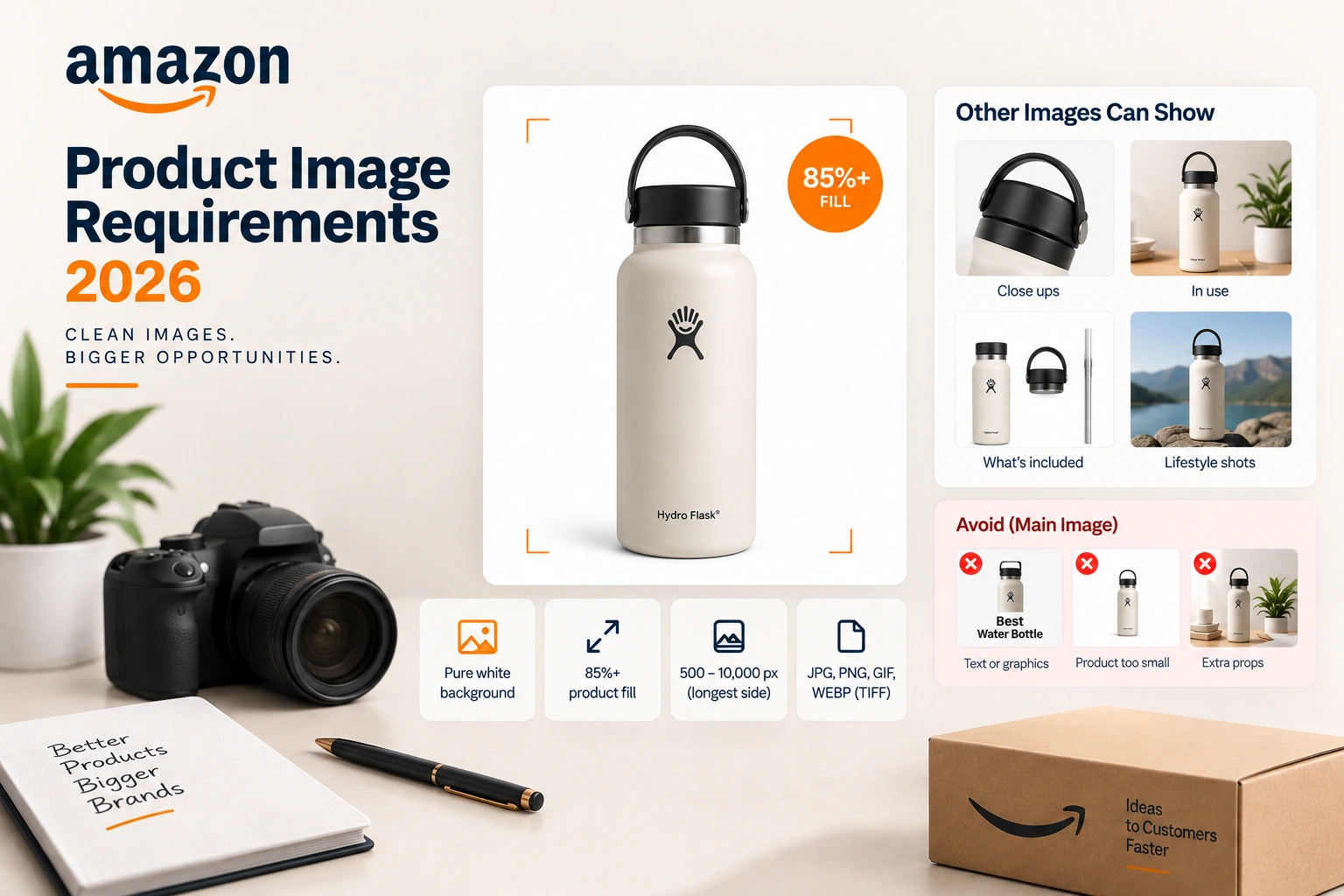
Most marketplaces require a plain white background on the main image and prohibit text, badges and props on it. Those rules are enforced, and a suppressed listing costs more than the cleverness gained.
This is the one image worth testing, and on marketplaces that offer an experiment tool it is the cheapest test available.
The shots that answer objections
Scale. The commonest return reason in half of all categories is that the item was not the size the buyer imagined. One photograph with a familiar object beside it prevents more returns than any sentence.
Detail. Material, finish, stitching, the port on the back. Whatever the reviews complain about is what this shot should show honestly.
In use. The product doing its job, with a person where a person belongs. It sets expectations and it sells the outcome rather than the object.
What is in the box. Everything included, laid out. It removes an entire class of question and an entire class of complaint.
Comparison. Where a range exists, one image showing which is which saves the shopper going back to search.
Infographics are photographs with a job
A photograph with two lines of text on it answering the question the reviews keep asking is usually the highest performing image in a set after the main one.
Restraint matters. Three words that answer the objection beat a paragraph nobody reads at thumbnail size, and every marketplace has rules about what may appear on which image.
Specification and requirements
Shoot larger than the marketplace minimum so the zoom function has something to work with, keep the aspect ratio the platform expects, and export in the format it asks for.
Colour accuracy is a returns problem rather than an aesthetic one. A product that arrives a different shade than the photograph promised comes back, and the cost is the shipping both ways plus the review.
Where the brief comes from
Not from a mood board. From the reviews, the returns and the questions on the listing, because those are the objections the images have to answer and they are written in the buyer's own words.
Read the one and two star reviews on your product and on the three competitors above you in search. The complaints repeat, and each repeated complaint is a shot: too small, looked cheaper than the photograph, missing the part I expected, hard to tell which one to buy.
That exercise takes an hour and it produces a better shot list than any photographer can write for you, because a photographer can see the product and cannot see the disappointment.
One shoot, several channels
The same session should produce the marketplace set, the store's product page set, the advertising crops and the social formats. Shooting for one channel and re-shooting for the next is the commonest waste in creative budgets.
Plan the shot list against the channels before the day rather than after, including the vertical crops, because reframing a horizontal photograph into a vertical placement rarely survives the crop.
What we do with this
Photography, A+ content and listing imagery are creative work planned from the same evidence that drives the listing: the reviews, the returns and the questions.
The images then do their job inside Amazon, Walmart and Shopify listings, which is why the brief comes from the account team rather than from a mood board.
If a catalogue needs a shot list before it needs a studio, that is where to start.
Frequently asked questions
The questions that come up most often on this subject.
As many as it takes to answer the questions that stop a purchase, which is usually six or seven: the main image, scale, detail, in use, what is in the box, a comparison where a range exists, and an infographic answering the commonest objection.
Most marketplaces require a plain white background, the product filling most of the frame, and no text, badges, props or watermarks. The rules are enforced with suppression rather than a warning, so they are worth reading for the category you sell in.
Indirectly and strongly. Ranking follows conversion, and images are the largest single influence on whether a shopper who lands buys. A better main image also raises click-through from search, which compounds the effect.
Whichever produces consistent, correctly specified images at the volume your catalogue needs. A studio is worth it for hero and lifestyle work and for a large first shoot. Ongoing variants and simple detail shots are frequently better in house once a repeatable setup exists.
No scale shot. Items arriving smaller than the buyer imagined is one of the largest return reasons in most categories, and one photograph with a familiar object beside the product prevents more of them than any amount of copy.
Yes, in the secondary slots, and they are usually the best performing images after the main one. Keep them to a few words answering a real objection, and check the marketplace's rules on which slots allow text.
It is a returns problem rather than a taste one. A product that arrives a different shade than the photograph promised comes back, and it costs the shipping both ways plus a review that will deter other buyers.
The same shoot, not the same crops. Marketplaces, product pages, advertising and social all want different framing, so the shot list should be planned against every channel before the day. Reframing a horizontal image into a vertical placement rarely survives.
When the evidence changes: a new objection in the reviews, a competitor doing something better, a variant added. A catalogue where the images have not been touched in two years is usually leaving conversion on the table.
On considered purchases and anything that needs demonstrating, yes, and it is the same brief: answer the objection. On a simple, obvious product it adds less than a better set of stills, so the money is usually better spent on the images.