Where Marketplace Creative Budget Goes First: Main Image to Brand Store
A brand with a limited creative budget gets the most from it in a set order: the main image, the gallery, A+ content, the Store, then video and ad creative, all from one set of brand rules. Why each comes where it does.

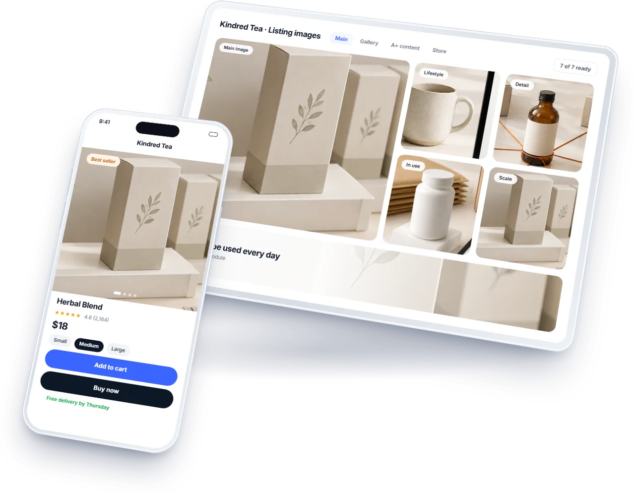
The Short Answer
Creative on a marketplace is not one job but several, and they do not pay back equally or at the same time. The main image decides whether a listing is clicked at all, so it comes first. The gallery decides whether a shopper who clicked is convinced, so it comes second. A+ content and the Brand Store work on shoppers already interested, so they come after, and video and ad creative amplify what the listing already does well.
Underneath all of it sits one set of brand rules, so the pieces look like one company. A brand that spends in this order sees a return at each step and builds on it; one that starts with the Store or a brand film often has beautiful assets sitting on top of listings nobody clicks.
First: The Main Image
The main image is the only creative a shopper sees before choosing to click, at thumbnail size, beside every competitor. It is judged on legibility, not beauty: the product large in the frame, on the background the marketplace requires, its shape readable at a glance. It also carries the strictest rules, and a main image that breaks them can suppress the listing, as set out in Amazon product image requirements.
It is the cheapest creative to test, because a better main image shows up directly in click-through rate. Brands enrolled in Brand Registry can run a main image against an alternative with Amazon's experiments tool, as the main image A/B test explains. Start with the products that already sell, where a better click rate pays back fastest.
Second: The Gallery That Answers Objections
Once a shopper has clicked, the remaining images do the selling: scale, detail, the product in use, what is in the box, and the infographic that answers the question the reviews keep asking. These are briefed from the reviews and the returns rather than from a mood board, because the objections are already written down in the buyer's own words. The shot list and why it works are in eCommerce product photography that sells.
The gallery comes before A+ because every shopper on the page sees it, on every device, while A+ sits further down where only the more interested scroll. A product with a weak gallery and polished A+ has spent in the wrong place.
Briefing the Gallery From Reviews and Returns
The gallery's job is to answer the questions that stop a purchase, and the brand already has those questions in writing: in its reviews, its returns and its customer messages.
Collect the objections. Read the last fifty reviews of the product and its closest competitors, the return reasons and the questions customers ask before buying. Write down every doubt they express: will it fit, is it big enough, what is in the box, how does it compare, will it last.
One image per objection. Rank the doubts by how often they appear and how much they decide a purchase. The top five or six become the gallery: a scale image for the size question, a contents image for the box, a detail image for quality, a comparison for the alternatives, the product in use for the rest.
One message per image. An image that tries to answer three questions answers none at thumbnail size. Each image should make one point that can be read on a phone in a second, with any text large enough to read there.
Order by doubt. The image answering the commonest objection goes second, straight after the main image, because many shoppers see only the first few.
Revisit when the reviews change. A new run of complaints about the same thing is a brief for a new image, or a sign the product needs fixing first.
Third: A+ Content
A+ content is for the shopper who is nearly decided and scrolls to check: comparison charts across the range, the details that did not fit the gallery, the brand story that makes a second purchase likelier. It needs Brand Registry, and its modules and the premium version are compared in A+ content and Premium A+.
Its most useful module for most brands is the comparison chart, because it moves a shopper between the brand's own products instead of back to the search results. Build A+ per product family rather than per product, so one set of modules serves many listings.
Fourth: The Brand Store
The Store is a destination rather than a product page: where Sponsored Brands traffic lands, where a shopper searching the brand name can browse the range, and where seasonal events get a home. It pays back once there is traffic to send it, which is why it comes after the listings that earn that traffic. What it is for is in the Amazon Brand Store and what it is for, and how to get it through moderation is in Brand Store moderation.
Then: Video and Ad Creative
Video earns its place where a still cannot explain the product: how it works, folds or fits. The same footage serves the listing, the Store and video ad formats, so it belongs on the same shoot as the stills rather than a separate production. Ad creative, the headlines and images in Sponsored Brands and display ads, works best when it repeats what the listing already proves, because a shopper who clicks an ad should land on a page that says the same thing.
These come last not because they matter least but because they multiply what is already there. Advertising a listing with a weak main image buys clicks on a page that does not convert them, and a brand film shown to shoppers who then meet a muddled listing has paid to send them somewhere that lets them down.
When they do come, brief them from what the listings have already proven: the angle, the claim and the image that tested best are the ones the ads should carry.
One Shoot for Every Marketplace
A brand selling on Amazon, Walmart and TikTok Shop does not need three shoots. It needs one, planned for the strictest rule on each point, so every marketplace's images come out of the same day's work.
Shoot large and frame for a square. Walmart recommends 2,200 pixels a side and TikTok Shop wants square images, so shoot with room to crop square well above that size. Amazon accepts any rectangle but works best square as well.
Photograph the front as well as the hero angle. TikTok Shop's main image shows the front of the product, while Amazon's best main image is often a three quarter view. Taking both for every product costs minutes on the day and saves a reshoot.
Product alone, then contents, then styled. The product alone on white gives every marketplace its main image. The product with everything in the box gives the contents image. The styled and in use shots give the galleries, A+ content and the Store.
Video on the same day. The same set, light and products can produce the short videos a listing and its ads need, for a fraction of the cost of a separate production.
The rules each marketplace sets, side by side, are in Amazon, Walmart and TikTok Shop image requirements.
One Set of Rules Under All of It
Every step above draws from the same brand rules: the logo and its versions, the colours, the typefaces, the tone of the copy, the photographic style. Written once, they keep a main image made this month and a Store page made next year looking like the same company, and they let several designers work without the catalogue drifting. What each platform checks in a brand's guidelines is in brand guidelines for eCommerce brands.
Write the rules before the gallery work at the latest. A brand that writes its guidelines after three rounds of creative usually spends a fourth round making those three consistent.
How to Tell Each Step Worked
Each step has its own measure, and reading the right one is what keeps the next step funded. A main image is judged on click-through rate from search, read for the same search terms before and after, or directly in an experiment. The gallery is judged on conversion: the share of sessions that buy, by product, over the weeks after the new images went live.
A+ content is judged on conversion as well, and for a range on how often shoppers move between the brand's own products. The Store is judged on the sales it is credited with and on how long visitors stay. Video is judged on the conversion of the listings that carry it against similar ones that do not.
Read each over enough weeks to be sure, and against the season, because a gallery replaced in November will look better or worse for reasons that have nothing to do with the images.
Briefing a Designer or Studio
The quality of marketplace creative is decided more by the brief than by the studio. A good studio given a vague brief produces attractive images that answer nobody's question.
The facts. Dimensions, materials, contents, compatibility and the claims the brand can support with evidence. A designer who has to guess at a fact either leaves it out or gets it wrong.
The objections. The ranked list of doubts from reviews and returns, with the image each one should become. This is the part that turns pretty images into images that sell.
The rules. The brand's guidelines, and each marketplace's image rules for the placements being made: what may appear on a main image, what sizes, what text. A main image that breaks a rule is a reshoot.
The deliverables. A list of every image and video, with its placement, size and format, so nothing is missed and nothing is made twice. Ask for the layered source files and the rights to use the work everywhere the brand sells.
Examples, good and bad. A few competitor images that work and a few that do not, with a sentence on why. They save a round of revisions.
Agree the review. One round of comments on drafts, collected from everyone in one document, and a final check on a phone at thumbnail size before anything is approved.
When to Break the Order
Two situations justify changing it. A brand about to launch a range needs its Store ready for the launch traffic, so the Store moves up for that range. And a brand whose main images are already strong, tested and current should not redo them for the sake of the sequence; it starts at the first step that is actually weak.
The order is a default for spending, not a rule against judgement. What it prevents is the common mistake of spending first where the work is most enjoyable to commission rather than where it pays back.
Spending Within the Order
Within each step, spend by revenue: the products that sell get the work first, because that is where a better image or a clearer chart pays back in weeks. A long tail of slow products can keep tidy basics, a compliant main image and accurate gallery, until one of them starts to sell.
Each step is a service of its own in our creative and media work: main image design, listing images, A+ content, Brand Store design and brand guidelines, planned in this order.
Frequently Asked Questions
The questions that come up most often on this subject.
The main image, because it decides whether a listing is clicked at all and its effect shows directly in click-through rate. Then the gallery images that answer shoppers' objections, then A+ content, then the Brand Store, then video and ad creative.
For most brands A+ content comes first, because it works on every product page a shopper is already looking at. The Store pays back once there is traffic to send it, such as Sponsored Brands and searches for the brand name.
Every shopper on the page sees the gallery, on every device, while A+ sits further down where only the more interested scroll. A product with a weak gallery and polished A+ content has spent in the wrong place.
When a still image cannot explain the product, such as how it works, folds or fits. Shoot it on the same day as the stills, because the same footage serves the listing, the Store and video ads.
Before the gallery work at the latest. Written once, they keep every image, A+ module and Store page consistent across designers and years; written after several rounds of creative, they usually mean another round to make the earlier work match.