The New Seller Central: Where Everything Moved and How to Work in It
Switching back is going away. Where the old menus went, what Amazon has built in response to the complaints, how the Action Center decides what it shows you, and the six things to set up in the first hour so the new interface costs fewer clicks rather than more.


Loading Article banner
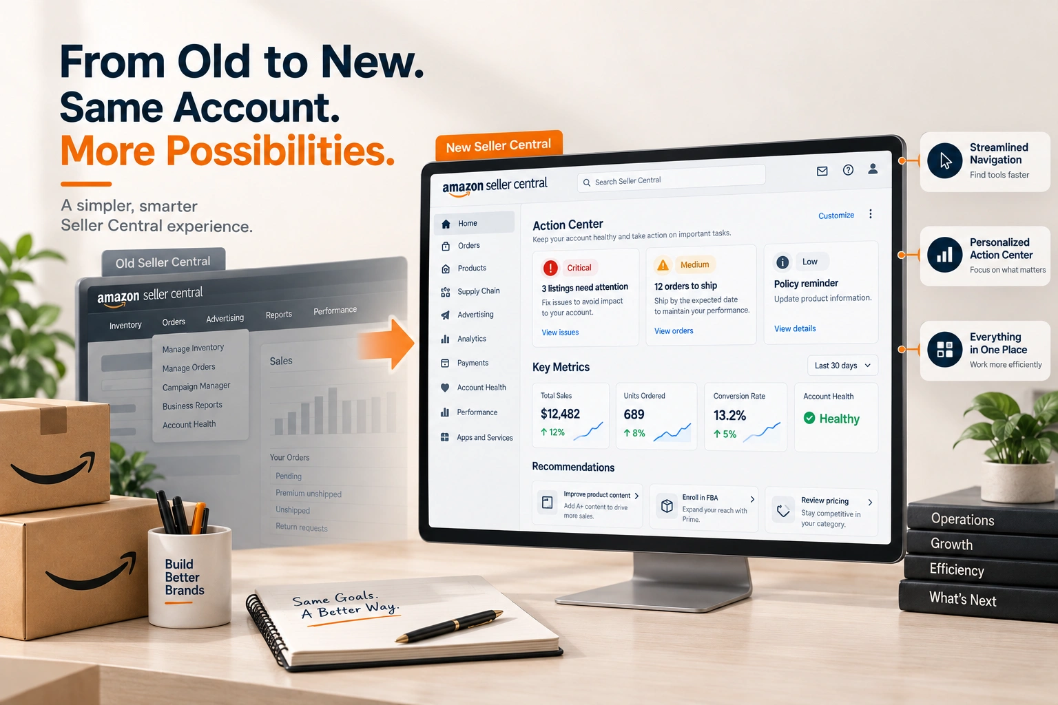
The notice reads: soon you'll be using the new Seller Central with improved tools and a streamlined experience, and switching back as your default will no longer be available. The thread it started on the Seller Forums ran to nearly ninety replies, and the two feedback threads Amazon opened alongside it ran to a hundred and seventy more. The complaints are consistent: reports that cannot be found, orders that take nine clicks where one used to do, a left pane that covers the fields on Buy Shipping, a dashboard that cannot be set to a period.
This is the working guide for the switch: where the old things went, what Amazon has built since the complaints, how the new front page decides what to show, and what to set up in the first hour. The facts are Amazon's own posts; the workarounds are what we have settled on running client accounts in it.
Where the old menus went
The new interface groups tools into workspaces rather than the old top menu, and the names changed with the grouping. Amazon's own tooltips connect them: Catalog became Products, Inventory became Supply Chain. Orders stays Orders, but the order list is reached through the workspace rather than the top bar, which is where the click counts sellers complain about come from. Reports are split between the workspace they belong to and the Analytics area, and a report that lived under Reports > Business Reports is now found by name rather than by menu.
Amazon has built four things for this, as it set out in its navigation post. A site map, reached from the navigation menu or the footer, lists every tool by workspace; it is the page to open when something cannot be found. Breadcrumbs show the path, as in Products > Manage Products > Manage A+ Content, which is also the path to remember. Tooltips on hover map the old name to the new one. And bookmarks, which Amazon said would arrive within two weeks of the post, give one click access to the pages used most. Ctrl+click and right click to open a menu item in a new tab, which broke in the first release, works again across the menus.
What the Action Center is, and how to make it useful
The new front page is the Action Center, and it is what sellers meet first and like least. Amazon's description is precise. It shows two kinds of card: action cards, which are tasks required of the account, such as orders to ship, messages to answer and suppressed listings to fix; and recommendation cards, which are optional, such as enrolling a product in FBA, adding A+ content or matching a competitive price. Each action card carries a badge: critical, where the account is at risk of deactivation; medium, where a listing is at risk or a term has been breached; low, a compliance reminder.
The two controls that make it liveable are the ones most sellers have not found. An action card can be hidden for seven days; a recommendation card can be hidden permanently. Amazon says feedback on a card refines what is shown, and that the centre is contextual: product tasks appear in the Products workspace, order tasks in Orders. Hide every recommendation card in the first session, and what remains is a list of what actually needs doing, with the critical items on top, which is closer to a useful account health view than the old front page ever was.
The reports question
The complaint that recurs in every thread is reports: the business report by month against the previous year, the parent and child sales view, the at a glance comparison graph. Some of these moved and some changed shape. The sales dashboard in the new interface draws by day and hour by default, which is why sellers describe the lines as useless for a monthly read; the period is set on the dashboard rather than in a report. The detail reports are under Analytics, and the site map lists them by their current names.
The working answer is to stop looking for the report by menu and find it once by name through the site map, then bookmark it. Business reports, the search term report, the inventory ledger and the payments transaction view are the four we bookmark on every account we run. The transaction view matters more than it looks, because it is where carrier adjustments and reimbursements appear, and where the figures behind FBA reimbursements are read. The fee lines it carries are the ones Amazon seller fees explained walks through.
The left pane, the mobile lag and the clicks
Three practical complaints and their workarounds. The left navigation pane overlays input fields on some pages, Buy Shipping among them, so that package dimensions cannot be typed until the pane is collapsed; collapse it, and it stays collapsed for the session. Android browsers lag before the page can be zoomed; the mobile app is the better route for anything beyond a quick look, and the app did not change. The click counts on orders come down with bookmarks to the filtered order views used daily, which is what the bookmark feature is for, and with the Ctrl+click fix, which lets a day's orders open in tabs from one list.
Seller Assistant, the AI tool that sits in the new interface, draws its own complaints for turning one step tasks into five. It can be ignored. Nothing in the account requires it, and the tools it fronts are all reachable directly.
The first hour in the new interface
Open the site map and read it once, top to bottom, so the workspaces are a map in the head rather than a search every time. Bookmark the six pages the account uses daily: the order views, the business report, the inventory ledger, the transaction view, account health, and the case log. Hide every recommendation card in the Action Center. Collapse the left pane. Check that the shortcuts and saved searches carried over, which Amazon says they do. And check account health on the new page, because a dashboard that looks different is a dashboard where a critical badge can be missed on the first day; the account health article sets out what each figure means.
One more thing from the threads is worth taking seriously. An experienced seller pointed out that this happens every two or three years, and that the accounts moved early meet the bugs while the accounts moved late get the fixes. The Tell the Team posts promise a You Spoke, We Built series, and the bookmarks feature was the first result of it. A seller who leaves the switch until it is forced gets the later version. For the accounts we run through Amazon marketplace management, the switch is done deliberately, once, with the hour above, and the case log is checked the same day for anything the new interface hid. The routine for that log is in the Seller Support cases article.
Frequently asked questions
The questions that come up most often on this subject.
Amazon's notice says switching back as your default will no longer be available, so yes, for accounts that receive it. Shortcuts and saved searches carry over. Amazon has not published a single date; the notice appears per account.
Split between the workspace they belong to and Analytics, under their current names. Open the site map from the navigation menu or the footer, find the report by name once, and bookmark it. The sales dashboard draws by day and hour by default; the period is set on the dashboard.
Catalog became Products and Inventory became Supply Chain. Amazon's tooltips on the new menus show the old name against the new one, and breadcrumbs show the path, as in Products > Manage Products > Manage A+ Content.
Not entirely, but action cards can be hidden for seven days and recommendation cards permanently. Hide every recommendation card and what remains is the list of tasks the account actually requires, with critical badges on top.
The left navigation pane overlays the input fields on some pages. Collapse the pane and it stays collapsed for the session. Sellers reported it in Amazon's navigation feedback thread and it is on Amazon's list.
Open the site map. Amazon added one in early September 2026 showing every tool in the new Seller Central organised by workspace, reached from the navigation menu or the footer of any page. Every sub-navigation page now carries breadcrumbs at the top (Products, then Manage Products, then Manage A+ Content, for example), and hovering a menu item shows where a renamed tool went: Catalog is under Products, Inventory under Supply Chain. Bookmarks for one-click access to the pages you use most were announced as the next addition.